How to Style a Bookcase…against the rules
When it comes to style and decor, I will be completely honest and tell you that I care very little about the rules. I’m far more interested in creating designs that feel right for me, even if it goes against the grain.
Styling shelves is one of those areas where designers like to create rules, but today I want to talk about the ways that you can break those rules and still create a beautiful aesthetic.
Full disclosure…I have a complicated relationship with rules. In many ways, I would say that I’m a rule follower. But the truth is, I tend to only follow those rules that make sense to me. If it’s logical and fits with what I believe, then yes, I’m on board. But if not, you might call me a bit of a rebel.
For example, I always wear my seat belt in the car. I never try to go through the express line at the grocery store with more than 15 items in my basket. And I always wear ear and eye protection when using power tools. These things all make sense to me. Those rules are driven by logic, so they definitely appeal to me.
But I’m also the same person who spent my fair share of time in detention for making childhood friends laugh when they were having a bad day (a.k.a. distracting my classmates). I guess you could say that I’m okay with breaking the rules to spread kindness and happiness to others.
I will always speak out of turn to advocate for someone who’s being disadvantaged. If you are neutral in situations of injustice, you have chosen the side of the oppressor. (Thank you, Desmond Tutu, for that!)
And I’m not ashamed to say that, before I was self-employed, I opted for a very loose definition of a “sick day” when I needed a break. Preventative self-care is vitally important to maintaining well-being.
So, if the rules don’t make any sense to you, should you bother to learn them?
Well, maybe.
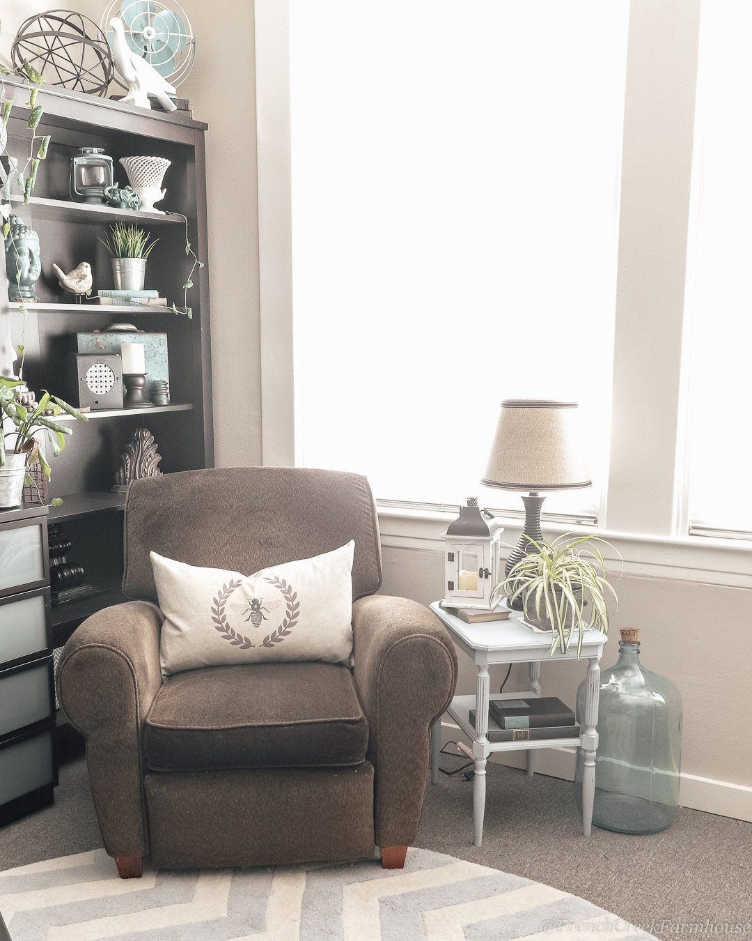
A few years ago, I added a couple of bookcases to my office, and suddenly found myself with a design challenge that I needed to remedy. I didn’t have nearly enough books to load up the shelves at the time, so I knew I needed to decorate to fill in the spaces.
These are the kinds of problems I enjoy the most!
I started by heading to Pinterest and pinning every attractively styled bookcase I could find. I also read a bunch of guides that listed gobs of design rules to follow for decorating shelves.
But I started to notice that a lot of the rules often contradicted other rules. Even looking at my collection of appealing Pinterest images highlighted the variations in styles–many that went against the “rules”, but still looked great.
The problem with rules is that they are often interpreted as absolutes. This kind of rigid inflexibility, however, goes against everything I believe when it comes to designing your personal spaces.
The truth is, when it comes to design, there are loads of helpful guidelines–but anyone proclaiming absolute “rules” is missing the whole point of designing a home you’ll love. What’s most important is decorating your space in a way that brings you comfort and joy.
In short: Learn the rules, but be willing to break them!
In this guide, we’ll take a look at how you can design and decorate a bookcase to fit your style. In each example that follows, a design “rule” will be broken. Then, I’ll explain why the design still works by highlighting some guidelines that will help you create your own style–even if it might contradict another rule you’ve learned.
 |
| Source: House Beautiful |
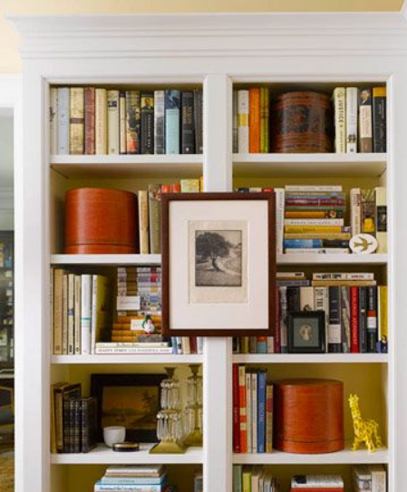
Broken Rule #1: Don’t overcrowd–leave airy spaces in your shelves.
Why it works: Even though these shelves are packed to the gills, the designer has utilized color to create negative space in the shelves.
Notice the round red boxes? They give the visual impression of blank space on these shelves. Clustering similarly colored books together does the same.
Even though there’s not a bit of unused space, the shelves don’t appear chaotic or cluttered.

 |
| Source: Johanna Bradford |
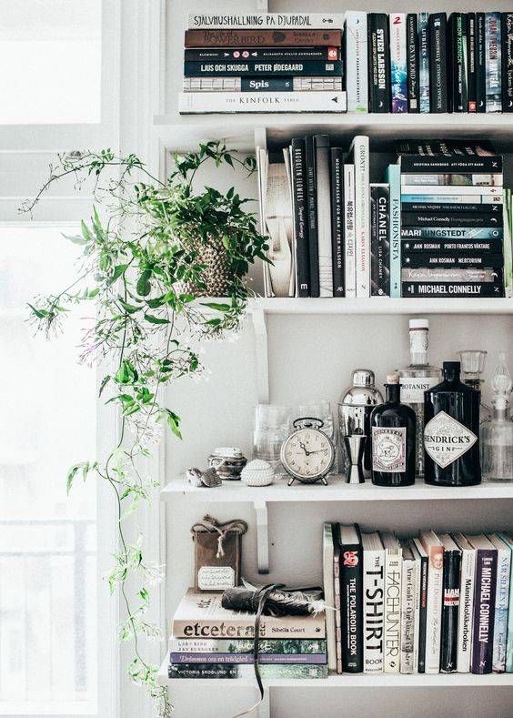
Broken Rule #2: Include containers for tidy storage.
Why it works: There are a number of loose objects on these shelves that could be housed in containers. However, the designer has arranged them in a visually appealing way to minimize the risk of the shelves feeling like a chaotic dumping ground of “stuff”.
Two ways this works for this design are: 1) the items (as well as the books) are monochromatic and flow well together, and 2) the items are arranged in height order so that they visually “make sense” to the brain and appear tidy.
{Related: How to Safely Hang Heavy Stuff on the Wall}
If you took this same bunch of items and arranged them haphazardly, the shelves would feel very cluttered and disorganized. But these two adjustments make everything seem orderly, just as they are.

 |
| Source: Designlovefest |
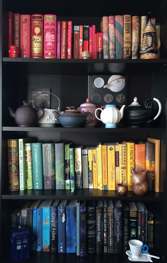
Broken Rule #3: Vary the direction in which books are stacked.
Why it works: A common technique when designing shelves is to stack books both horizontally and vertically. You can even turn the books around so that the pages are faced toward you while the spines are hidden.
These are excellent ways to add variety and visual interest to shelves, but certainly not the only way.
The books on these shelves are all arranged in exactly the same manner, but the visual interest comes from arranging them by the color of the spine so that it creates a rainbow effect. Gorgeous!

 |
| Source: Modern Chemistry at Home |
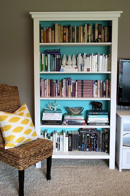
Broken Rule #4: Sort books by height.
Why it works: I’ve read about a billion blog posts dictating that books should be organized by height, with tall books on bottom shelves and shorter books up high. The reason this rule exists is to try to balance the weight on the shelves.
Not the actual weight–but, instead, the visual weight.
In this design, the weight is balanced on each shelf by both the color grouping, as well as the particular placement of each book. Take a look, for example, at the cluster of white books on the second shelf from the top.
The books in this section are all varying heights, but your eye isn’t distracted by that. Because the books are lined up in such a way as to create a line of average height, your eye sees them as a solid white block. The brightly colored paint used for the interior of the shelves helps with that, as well.
This technique balances the weight without following the rule, and it’s simply stunning!

 |
| Source: Apartment Therapy |
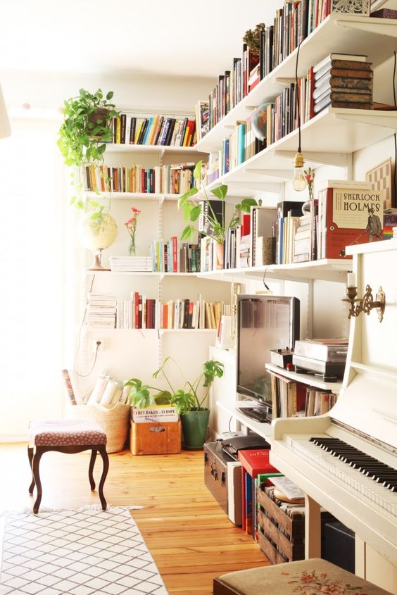
Broken Rule #5: Organize books by color.
Why it works: Very similar to Rule #4, organizing books by color can help to manage the visual weight of your shelves. And, it can be really pretty, like in example #3. But it’s not a necessity.
This design includes books of varying colors all displayed randomly. However, just like in example #4, the weight is partially controlled by creating a line of height that makes everything appear orderly.
{Related: Botanical Design Inspiration}
The other way the weight is controlled is through the use of the three green plants. Your eye is going to be drawn to groupings of 3, so it further negates the color variation within the shelves of books. The plants take center stage in this design.

 |
| Source: The Merry Thought |
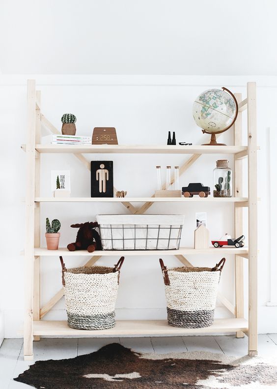
Broken Rule #6: Design with 3’s (or odd numbers).
Why it works: Continuing the idea from example #5, groupings of 3 are pleasing to the eye. The reason why lies in our psychology.
The human brain is wired to see patterns, structure, and logic. The principles that support this psychological function are known, collectively, as the Gestalt theory of visual perception. It works like this…
What do you see in this image?

This is called the Gestalt Triangle, and that’s probably what you saw–a black triangle. But, in reality, there are three white shapes that look a bit like PacMan. Your brain, however, desperately wants to create structure–something that’s familiar and symmetrical.
In the bookcase example above, the design works, in part, because of the style of the bookcase. Your eye is perceiving a triangular shape that would normally be achieved by grouping like items, but it’s happening mostly because of the ‘X’ design of the shelves.
The visual weight of the items on the shelves is also distributed along those guidelines, and they create a Gestalt Triangle without you even noticing, and without the items being noticeably displayed in trios. The two symmetrically placed baskets on the bottom shelf evenly distribute weight and create logical order that contrasts with the open space on the top shelf to give the illusion of two triangles.
Fascinating how the brain works, right?!

 |
| Source: Abigail Ahern |
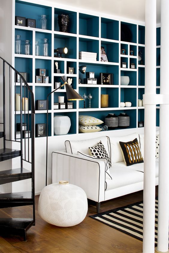
Broken Rule #7: Never leave large gaps.
Why it works: A visual gap within your shelves could feel out of place…as though something was missing. But just like in example #6, it can also create negative space for the mind to perceive the existence of something that’s not really there.
These shelves are an excellent example of using negative space in a pleasing way. The interior color of the shelves ends up being part of the shelf decor in the same way as the physical items.

 |
| Source: Driven By Decor |
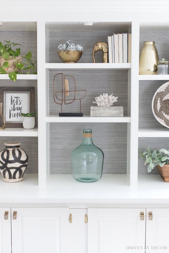
Broken Rule #8: Use consistent textures and patterns.
Why it works: There’s quite a lot going on within these shelves. There are plants, metallic accents, glass, pottery, wood, coral, woven baskets….it’s a really intricate design.
However, it works because the placement of the objects allows for the eye to create structure. Following the plant in the upper left corner down to the plant in the lower right corner, you’ll notice that the objects fall upon a visually (but imaginary) straight line.
Who knew that the precise alignment of a particular item could make all the difference? (Well, you knew, of course!)

 |
| Source: Manhattan Nest |
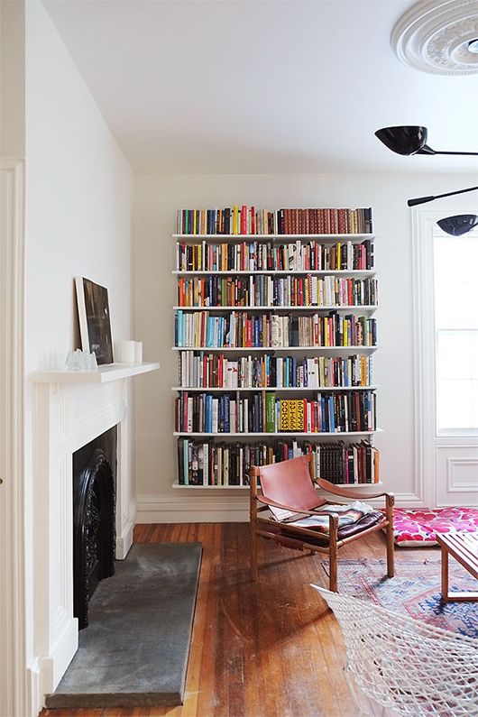
Broken Rule #9: Use few colors.
Why it works: Using few colors, or making sure that colors are grouped together, is very trendy. The “all-white farmhouse” has become hugely popular in recent years, as well. But color is a wonderful thing!
These shelves are visually pleasing because they create a contrasting focal point against a stark white wall. The books are the life in this extremely minimalist space, so their mixture of every color under the rainbow isn’t a distraction that feels cluttered. Instead, it feels vibrant and soothing in a room that would otherwise seem quite sterile.

 |
| Source: Better Homes & Gardens |
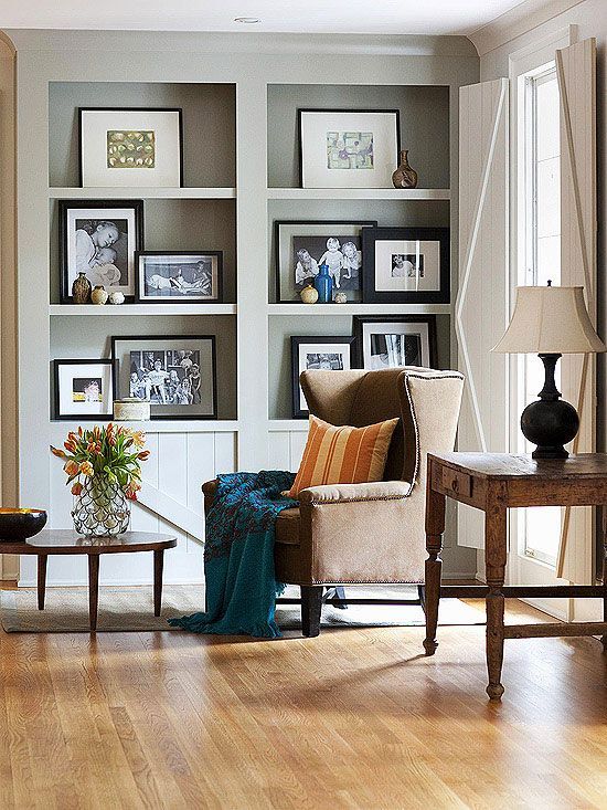
Broken Rule #10: Include plenty of books.
Why it works: In our own home, we have ten bookcases that we use to store our books, as well as an additional five wall shelves. I actually went and counted, just for this post.
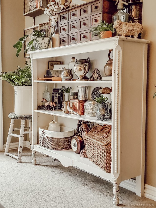
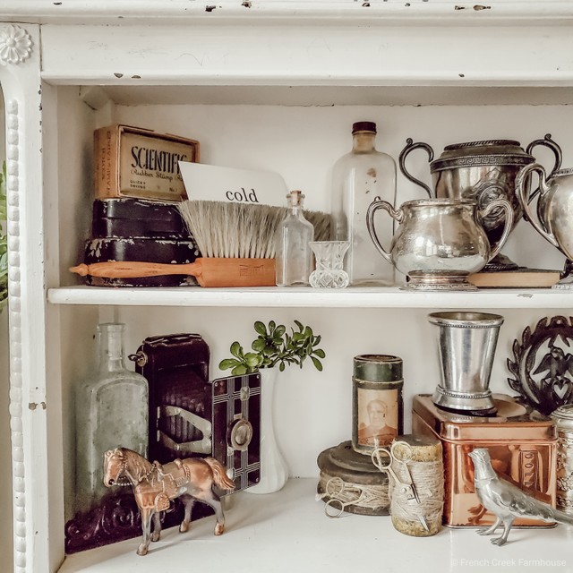
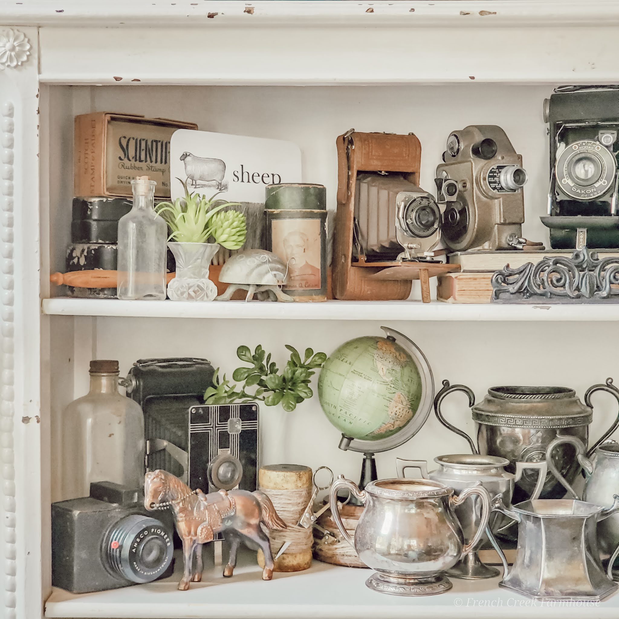
We also have one bookcase that I use to display vintage and antique treasures that I’ve collected over the years.
Without fail, every single time I share a photo of that particular bookcase that is not used for storing books, there is at least one person that will leave a snarky comment on my social media post criticizing me for not having books on my shelves.
{Related: Cozy Wintertime Family Room}
Let’s ignore the fact that it’s just plain bad behavior to troll a virtual stranger’s social media and make critical judgements, and instead let’s focus on the fact that shelves are made to contain objects.
Yes, shelves do a wonderful job of organizing books, but that’s not the only possible way they can be used. (Remember earlier when I said to ran far and fast in the opposite direction of people who tout “absolutes”? This is one of those times.)
If you want to decorate a bookcase without a single book…more power to you, my friend! Your home should be about creating comfort and joy for the people who occupy it. It should not be able adhering to anyone else’s version of ideal.
You do you. With or without books on your shelves!

I hope this guide for how to decorate shelves inspires you to break a few rules and design your home to be a place that you love. If you have a bookcase you’ve styled–with or without books–I’d love to see it. Tag me in your photos on Instagram or Facebook!
And, if you enjoyed this post, please pin it and share it with others who are looking for inspiration!






A perfect post for me to read this morning. Once I empty the bottom of my step back cupboard, I will start organizing both my cupboard, but also my plate racks.
I love how you decorate a bookcase. I usually don't put the same things together but what ever looks good to me. Congratulations, you are being featured on Thursday Favorite Things. I hope you stop by.
https://www.eclecticredbarn.com/2020/02/thursday-favorite-things_20.html
Hugs,
Bev
Love your esthetic! You are really talented with a great eye. Pinned!
I loved this post! I never follow the rules, but always feel bad about it, so thank you for the permission!
I've been struggling with my floating shelves in my living room. You have a lot of great ideas packed in here. I need to get back to work on those!
I totally agree it's okay to go against the rules! I love your amazing styling and treasures. Thanks so much for sharing at TFT. I am happy to feature you this week at TFT. Have a great weekend! https://followtheyellowbrickhome.com/calm-cozy-and-creative-home-ideas-at-thursday-favorite-things/
Oh we have a lot of things in common! I cannot stand arbitrary rules that make no sense and I will not only break them but I will challenge them to get them changed. Because I have little tolerance for ridiculous! On the other hand, what we do not have in common is beautifully decorated bookshelves! Although I would like to change that some day. My bookshelves are currently overrun by kids’ toys and papers and stacks of unnecessary clutter. But in due time, I will follow your lead. So many inspirational ideas in this post. Thanks for sharing and linking up and for being willing to break the rules!
Shelbee
http://www.shelbeeontheedge.com
Hi Kristi, I found this post from a link party of the Pams party and practical tips website. I like your ideas to decorate a shelve against the rules. The bookcases designs are nice.
Regards Homescute.com
Hi Kristi love how you write, your clever, funny and most of all have common sense. Very clever writing girl, thoroughly enjoyed reading your article girl, good job. Vicki
Great tips on styling a bookcase! I love how you encourage breaking the rules to create a unique and personalized look. A bookcase can truly transform a space, allowing for both functionality and creativity. I can’t wait to try out these ideas in my own home!
Thrilled to hear that you found some new decorating ideas! 🥰